Showing posts with label print. Show all posts

Friday, July 25, 2008

Update: True Blood

In my last post on the viral advertising campaign for HBO's new show, "True Blood," I mentioned their Tru:Blood campaign, BloodCopy blog, direct-mail campaign, and YouTube videos. Well, they didn't stop there. HBO has at least three more web sites related to the new show, and print ads to accompany them.

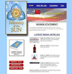
New York magazine's July 28-August 4 issue contains an ad for "Fellowship of the Sun," bearing the slogan, "Vampires are immoral." It directs you to a web site for the group, whose mission is "To preserve the strength and purity of the human race by preventing vampires from gaining a foothold in our businesses, government and communities." Like the other campaigns, though, the print ad is far superior to the web site itself. While the print ad is striking and certainly makes an impact (especially with its placement at the front of the magazine, before all the content), the web site is poorly designed and cheesy. The appearance of the site is most likely intentional, since the campaign seems all about vampires' rights, the contrast between the fellowship's print ads and web site is noticeable and jarring.


The web site for Fellowship of the Sun

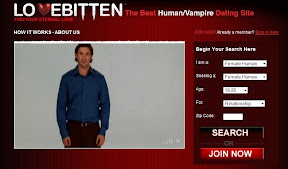
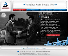
The Fellowship of the Sun site includes information for two more True Blood-related sites: Lovebitten and the American Vampire League. Lovebitten purports to be "the best human/vampire dating site" where you can "find eternal love." The site is more well-designed than the fellowship's web site, which goes along with the HBO campaign's general pro-vampire vibe. Likewise, the American Vampire League's web site is also well-designed, bearing some similarities to the polished web sites of politicians and political parties.


Lovebitten's web site


The American Vampire League's web site

I said in my last post that the campaign in general is quite impressive, which still holds true. However, with so many fictional campaigns to promote one show, HBO's promotion of True Blood becomes a bit overwhelming. After all, it's hard enough to keep up-to-date on all of one's favorite products, web sites, news, and real political issues as it is, without adding in a myriad of products, issues, and services revolving around a TV show. We won't know of the campaign's effectiveness (or lack thereof) until the show premieres in September, though, so for now we'll have to just wait.

-----------
Postscripts: I hope to upload a copy of the fellowship's ad soon. And HBO also has a True Blood comic book.

Thursday, July 10, 2008

True Blood

HBO has rolled out quite an impressive creative advertising campaign for its new series "True Blood," set to premiere in September.

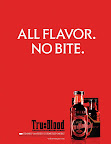
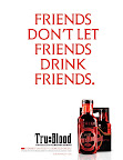
Print ads for a fictional product, "Tru:Blood," are appearing in popular magazines, while posters are showing up in NYC and TV commercials have been posted on YouTube. To accompany the ad campaign for Tru:Blood (a synthetic blood drink for vampires), HBO has set up a flash-heavy Web site that mimics those for popular alcoholic beverages, like Absolut vodka.

The viral campaign consists not only of ads for the fake drink, but also of a blog about vampires' integration into normal life, news clips about the new product and the integration, videos in which vampires around the world speak out, and a mysterious direct-mail promotion.

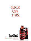
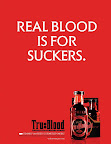
While the campaign as a whole is quite impressive, certain aspects are more well-done and much more realistic than others. The print ads are by far the best component of the campaign (and I'm not just saying that because I'm a print fan). The ads are bold and intriguing, and only the small-print HBO copyright gives a hint of the truth.


Print ads for Tru:Blood

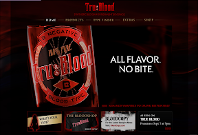
The Tru:Blood product Web site packs quite the punch, but loses some of its effect with its "As seen on True Blood" graphic. However, the interactive components and the effort put into the site keep it as the second best component of the campaign.


Tru Blood product Web site

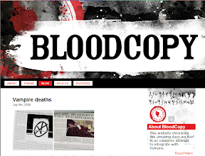
The vampire news blog, called "BloodCopy," is intriguing, but doesn't come across quite as realistically as the print ads and the Tru:Blood site. It is supposedly written about the vampires' integration by a non-vampire, but comes across as somewhat hokey. Plus, the fact that it's promoted on the Tru:Blood site seems to be a conflicting aim. After all, Tru:Blood is for vampires while BloodCopy is for mortals trying to make sense of the whole vampire integration.


The BloodCopy blog

The direct-mail promotion worked in the sense that it sparked interest, but it's receiving mixed reviews on the Web. Apparently, it is a two-part promotion. The first piece of mail consists of mysterious symbols and no message, and was followed up with a later piece that had more explanation. People who have read the books on which "True Blood" is based have been excited to receive the mail, but there have also been reports of the mail being received by people completely clueless about the books, and who thus didn't fully appreciate the campaign.


Discussion of the direct-mail promotion

But, despite the direct-mail promotion's failings, the "commercials" for Tru:Blood and related videos are, in my opinion, the worst component of the campaign. Both the French and the American versions of the commercials are hokey, unrealistic, and a bit off-putting. The other videos also fail at appearing realistic.


American Tru Blood commercial

I really haven't seen many, if any, campaigns like this before, so HBO deserves points just for trying something this comprehensive. And, while some components may not feel very realistic, they're a vast improvement over the character blogs and such that on most shows' Web sites.

Newseum

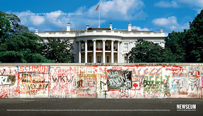
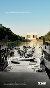
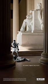
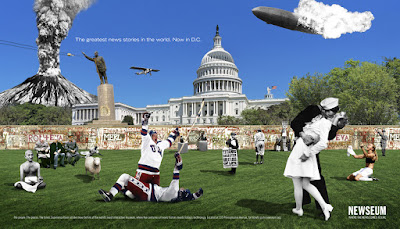
While some people think the current ads for Washington, D.C.'s Newseum don't do justice to journalism, I disagree. The ads are captivating montages that bring attention to just how important the news is to history. Their exciting visual element also adds greater appeal to a museum that would otherwise seem boring. After all, who would really think a museum of news was exciting? However, an ad that shows the Allies storming the Normandy beach... in D.C. makes the Newseum seem a pretty cool place to go.


Tuesday, February 19, 2008

Creative Advertisements

Society is filled with a plethora of advertisements, from prime time TV shows that often include 18 commercials per hour to magazines, which are becoming increasingly ad, not content, focused. The fall 2007 issue of Vogue was a record 840, but only 113 of those pages were editorial. The other 727 pages, or 87 percent, were advertisements. The issue weighed in at 4 pounds, 9 ounces! Those ads aren't cheap, either.

Yet despite the high cost of advertisements, whether they're in magazines or on TV, research shows they might not be all that effective after all. More than 30 percent of TV viewers mentally tune out during commercial breaks, while 41 percent channel surf and 33 percent talk through them. Only 5.5 percent of viewers fully tune in for commercials. It's also easy to skip past the ads in magazine, especially once you're familiar with where they show up. In fashion magazines, the first 10 pages or so are usually all advertisements.

Due to the ubiquity of advertisements and consumers' general disinterest in them, advertisers are coming up with continually more creative ways to get their messages across. The new and unique methods some firms have devised are surely memorable. Of course, if they become as commonplace as scented perfume ads or product placement in TV shows and movies, they too will cease to be memorable.

10 Creative and Memorable Methods of Advertising

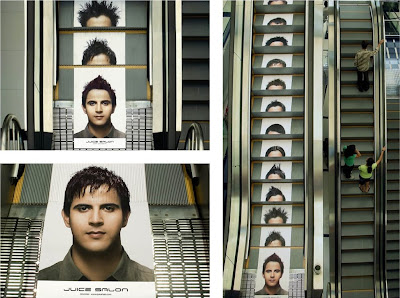
1. Escalator: Rediffusion DY&R in Mumbai, India, chose to advertise Juice Salon on an elevator. On the bottom of the elevator is an image of a man's head; on each step, a hairstyle. As the steps slide into the bottom of the elevator, the man's hairstyle changes.


A video of the ad in action is available on YouTube:


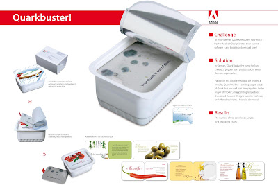
2. Moldy Cheese: The main competitor of Adobe InDesign (publishing software) is Quark, which has long dominated the publishing industry. "Quark," in German, is also the name for "curd cheese," a theme that Adobe played off of with a recent promotion for InDesign. Rapp Collins in Germany sent tubs of past-the-expiration-date Quark. Inside was a layer of "mould," and then a recipe book-inspired flyer advertising InDesign and offering a free download of the program.


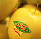
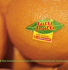
3. Fruit: Klas and Maria Lindstrand's new book, Tutti Frutti, is a fruits and berries resource with facts, recipes, and photographs for each fruit and berry. The advertisements? Fruit stickers. The stickers are the size of the brand stickers usually found on supermarket fruits, but bear the book's name and instructions to purchase the book online at adlibris. The advertising strategy was conceived by Klas, who also thought to mail the book to critics in the mesh packaging in which fruits, apples, and other fruits are often bought.


4. Dogs in the Park: Pedigree chose to time its adoption drive and the opening of its NYC Dogstore with the Westminster Dog Show. For the 21-year sponsor of the Westminster Dog Show, TBWA\Chiat\Day placed advertising dogs in Central Park. The orange, wooden dogs bore the message, "Wish I was here. But I'm not. Come visit me and other great shelter dogs at the PEDIGREE DOGSTORE on 46th and Broadway."


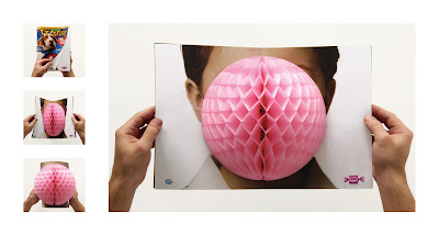
5. Bubble: For the Latin American candy company Arcor, Leo Burnett created a bubble ad. When a magazine reader opens the spread containing the Arcor ad, a 3-D "gum bubble" pops up, creating the illusion that the person in the ad has blown a bubble with Arcor gum.


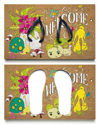
6. Welcome Mat: BBDO New York produced limited edition welcome mats to promote Havaianas flip-flops. The mats contained flip-flops so, when leaving for the day, one can simply step onto the welcome mat to put on shoes. Upon return, the flip-flops pop right back into the mat.


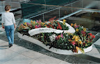
7. Flowerbeds: Another three-dimensional ad created for Havaianas by BBDO New York were giant flip-flop flowerbeds. Located where Havaianas are sold, such as in malls, the flowerbeds were designed to "remind people of Havaianas’ unique aesthetic of color, design, and the brand’s connection to nature and the outdoors."


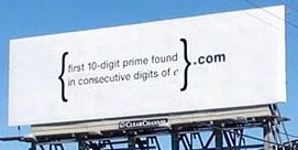
8. Codes: Several companies have employed this method in somewhat different ways. Google created a now-famous billboard that simply read, "{first 10-digit prime found in consecutive digits of e}.com". The billboard was displayed in Silicon Valley, while banners in Harvard Square carried the same message. Those smart enough to solve the puzzle discovered a Web site with another puzzle. Eventually, those who solved all the puzzles were asked to submit a resume.


When an expert typographer was needed at Lunar BBDO in London, the creative directors devised a similar plan. They created three coded advertisements. In one, the text was completely in Webdings, Wingdings, and Zapf Dingbats. The ads were placed at local design schools and ran in typographic publications. The campaign drew thirty responses.


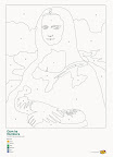
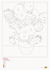
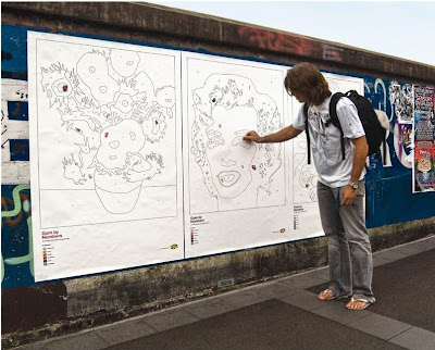
9. Gum-by-Numbers: Hubba Bubba chose to promote its product while fighting the gum-on-the-street problem. DDB designed paint-by-number posters for the company; the posters' color palettes are comprised of different flavors of gum. Gum chewers are encouraged to fill the famous images (the Mona Lisa and Marilyn Monroe) with their used gum.


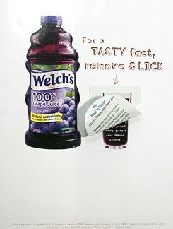
10. Flavor Strips: Most magazine readers are well-acquainted with scented ads, usually for perfumes. Welch's is making use of the new flavored-advertising technique developed by First Flavor. This month, issues of People magazine will contain Welch's ads with flavored strips that resemble mint breath strips. Readers are instructed: "For a TASTY fact, remove & LICK." The ads have sparked hygiene concerns, since magazines are often passed among readers. However, First Flavor assures that, due to the ad's design, whether the strip has already been licked is immediately apparent.


CBS talked to average consumers about the lickable new Welch's advertisements and the "ick" factor:


References:
> Blog archive @ I Believe in Advertising
> "'Forbidden Fruit' Book Advertises..." @ Adland
> "Google Entices Job-Searchers with Math Puzzle" @ NPR
> "If You Can Read This, You're Hired" @ CreativePro
> "Marketers Salivate Over Lickable Ads" @ The Wall Street Journal
> "Pedigree: Central Park" @ Creativity Online
> "The Ad Zapper in Your Brains" @ AdLab
> "Vogue Makes History" @ PRNewsWire

A slightly different version of this post appears on mental_floss magazine's web site.

Wednesday, February 13, 2008

Campaigns: Local vs. National

Although both local advertising campaigns and national ones have the same end goal--to sell something, the campaigns are usually drastically different. Local campaigns should, in theory, be able to better tap into the mentality of their target market, yet they tend to more straightforward, less interesting, and less creative than national campaigns. In fact, national campaigns that specialize for different markets, like Sprint's "Coverage like..." or AT&T's "More bars in more places" campaign, end up appealing to local markets more than the local ad campaigns created for those specific markets.
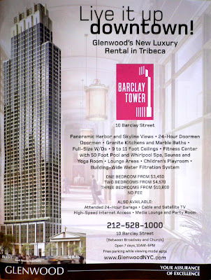
In magazines like New York, Philadelphia, and Baltimore Style, the local ads are usually for apartment buildings, restaurants, and theatrical performances. On the inside back page of a recent issue of New York ran an ad for Barclay Tower, "Glenwood's New Luxury Rental in Tribeca." Glenwood appeared to be marketing its newest luxury apartment building as the ideal apartments for young, wealthy, vibrant professionals in the "in" crowd. The ad, though, is rather boring and overrun with text, which would usually put off the exact crowd that Glenwood is attempting to draw in.


Ad for Glenwood's Barclay Tower, as seen in New York magazine

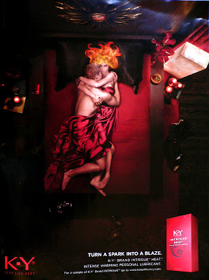
On that same page the next week ran an ad for K-Y® Intrigue Heat. The K-Y ad, part of a national campaign, much better tapped into the mentality of the young, wealthy, vibrant professionals than the Glenwood ad. The K-Y ad is more interesting visually, less overrun with text, and more unique than the Glenwood ad, and therefore better able to appeal to the young market. K-Y is marketing the Intrigue Heat lubricant as an exotic, exciting, passionate product, and its ad captures that feel. Glenwood, however, is trying to market Barclay Tower as an exciting place to live in the midst of the hustle-and-bustle of the city, using the line, "Live it up downtown!", but Glenwood is unable to convey that attitude through its ad.


Ad for K-Y® Intrigue Heat, as seen in New York magazine

Granted, Glenwood's product is vastly different from K-Y's. Their target market, though, is the same, and Glenwood (and other local companies) would do well to focus a little more on their actual ads. No matter how great the product is, if the company can't draw customers in through their advertisements, they won't do as well as they'd like to. (Plus, the money spent on the advertisements which, in the case of Glenwood, is significantly large, will have been spent in vain.)

Tuesday, January 22, 2008

Safety Ads

Advertisements for public safety organizations have, in general, become just as striking, polished, and professional as ads for billion-dollar businesses. Both the campaign created for the NSW Police Department by DDB and the one created for AM+Ri Hospitals by Ogilvy & Mather (Kolkata, India) use impressive imagery for safety topics.

NSW Police Department

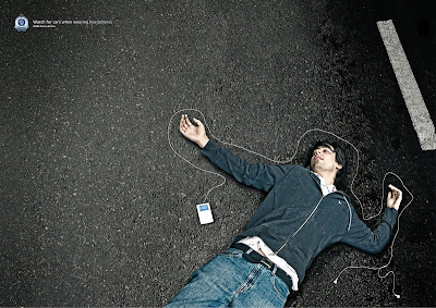
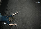
Ads for the NSW Police Department by DDB (Sydney, Australia)


DDB's campaign alludes to the ubiquitous iPod commercials that feature silhouetted dancers and the famous white iPod headphone cords. As a result, the ads especially attract the attention of teens and young adults, at whom the campaign is directed. The simple scenes--a body, iPod and cord, and asphalt--drive home the important message without being graphic or disturbing.

AM+Ri Hospitals

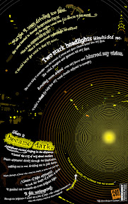
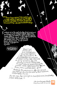
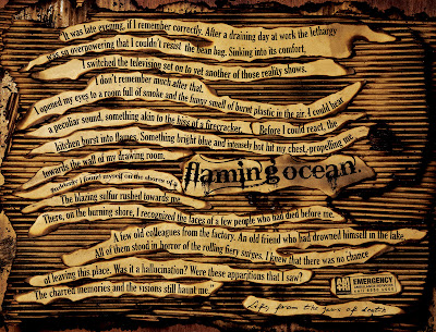
Ads for AM+Ri Hospitals by Ogilvy & Mather (Kolkata, India)


Ogilvy & Mather uses typography, colors, and shapes in the campaign to highlight the importance of hospitals and emergency ambulance services. Each ad tells a different story of possible death--fire, car crash, and suicide--but ends with life, not death, thanks to the ambulance service. Like the NSW Police Department ads, these ads are also likely directed at teens and young adults, though they would probably have a significant impact on anyone who saw them.

I'm glad that safety organizations are investing in well-designed advertisements. Any striking, well-designed ad is usually appreciated by me, but I am especially glad to see such talent and energy put to use for good causes--charities, public safety, health, etc. I hope more organizations learn from these wonderful examples.

(Click on the images for the creative details, as listed on www.adsoftheworld.com)